Transformation of Functional Requirements into UX Specification
I have been working as part of a team on a project to design and deliver a SharePoint 2010 solution to replace many paper-based processes. We have been required to understand in minute detail the day-to-day processes of a client made up of six discrete business areas. Following requirements gathering workshops, conference calls and e-mails we understand the business enough to be able to write documentation, design entity relationship diagrams and determine the best technology to use. As part of this process we are also delivering interactive wireframes developed by our Creative team.
Our creative team have not been involved in the requirements gathering phase for the functionality and so they do not have the in-depth understanding of the business processes. In order to understand the user interface requirements the Creative team had the functional documentation and the team who had gathered the requirements.
It became apparent very early that what was required was a visual representation of the functionality that had been documented. Over six to seven iterations and much discussion and experimentation we have come up with a visual language that is easily understood by all involved and is an effective tool that we can add to the other techniques we use to define solutions.
High Level Meanings
The first start in describing the interface was to decide on the high level shapes and their meaning. We identified four shapes:
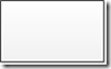
The simple rectangle represents a static screen within which data will be displayed and links will be available to the user.

The rectangle with the rounded bottom represents a form that allows a user to edit or enter data.

The diamond represents a user choice or a system decision. This is used when a user selects an item from a list or when the system decides which screen to direct the user to.
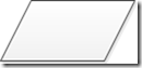
The parallelogram represents a background process such as the system updating data.
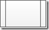
The rectangle with internal lines represents a navigational journey defined in a different diagram. This allows for the simplification of diagrams.
Reference
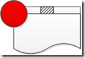
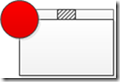
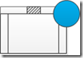
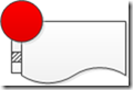
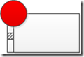
It was identified early on that there needed to be a way of referencing the shapes in a diagram so that supplementary information could be added to the documentation. This has been achieved by adding red circles with reference numbers for each screen and blue circle with reference numbers for navigation journeys.
Context
The next step was to add a navigational context to the high level shapes. We identified two styles of navigation that we wanted to indicate on the diagrams.
Horizontal Tab Groups
These are groups of screens with tabs across the top of the screens. These tab groups allow the user to view different lists attributes of the entity they are viewing.
Vertical Tab Groups
These are groups of screens with tabs to the left of the main screens. The vertical tab groups build up as the user enters information.
Display Hints
The final addition to the diagrams was the display hints . Display hints are intended to provide an indication of the type of layout that the screen will have. Screens can have more than one hint associated with them, e.g a screen might be modal and be used to edit an entity.
 List – This indicates that a list of entities is displayed. Usually the entities can be selected to be edited or viewed. Screens of this type usually have a link to allow the user to add a new entity.
 Add – This indicates that the screen is used to add a new entity into the system and should start with no data in any of the form fields.
 Edit – This hint means that the screen should be prepopulated with information already stored in the system.
 Chart – Screens with this hint contain one or more charts.
 Graph – Screens with this hint contain one or more graphs.
 Report – Screens with this hint display a graph.
 Modal – This indicates that the screen is a modal screen displayed over the top of the screen from which the user selected an entity.
Example
The following example uses a music management system as a sample solution. It demonstrates the navigation through the hierarchy of artist, album and album track.
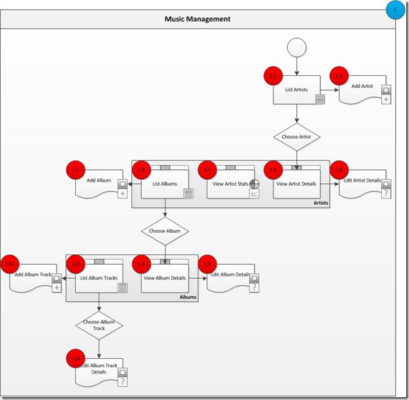
Each of the screens would be supplemented with a descriptions of the fields being edited, the columns being displayed or any other information that would add to the completeness of the documentation.
Points to note in the example include the use of the horizontal tab groups to allow the user to view different information related to the Artists and the Albums and the use of the modal screens to allow the user to add or edit the Artists, Albums and Album tracks.
Summary
I have explained the use of the shapes that we are using to describe the interface aspects of the solution that we are designing. The evolution of these shapes will surely continue as the team evolves the solution but as a starting point these shapes have proven extremely useful and easy to understand and use.